


 Reply With Quote
First, I'd like to thank you for being our first Critique Corner participant. Of course you know, since you set up the section, that this specific one goes more in to detail and can be very technical as well as very critical (trying to avoid harsh here). With that being said, lets take a look at the shot and see how we could improve it.
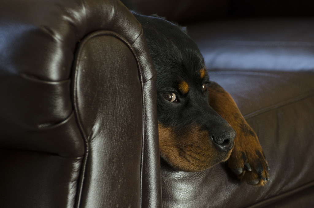
Off the bat the one thing that stands out to me is the White Balance. Seeing your EXIF info (excellent exif data btw), I see you used auto white balance. The auto white balance has given the shot a very mild green hue which is affecting the overall shot. It isn't a huge deal, but as soon as I opened the thread, that is the first thing that stood out to me.
With any moving (or potentially moving ) subject, you always risk that they may move from a position or pose that they were in that you really wanted to capture. I feel that is the case here. However, after you got this first shot done (I call this the out of the way shot, because you've gotten the main shot "out of the way"), I would have moved off to the right a little bit and I would have avoided having that crease on the couch coming from right out of the top of the subject. Furthermore, had you moved off to the right a little bit, I believe your subject would have actually tracked you with his eyes only, and not head, at least that is the feeling I am getting from the shot alone. Had you done this, the overall shot would have been a little more comical and would have translated the "lazy sunday" feel that this shot is already portraying well.
Centralized composition is one area that I try to get people to avoid purposefully. That isn't to say that you should never shoot with your subject in the middle, but you should shoot enough out of middle comp, that when you do it, it is intentional. I believe this would have been a slightly better shot, had you moved the frame just a bit, or even better, if you would have zoomed in just a little more and have had him on the lower right corner slightly.
The exposure seems almost perfect to me, although the away side of the subject is a little on the dark side. Considering your subjects coat, this is to be expected, even with perfect exposure. I believe that if you would have exposure compensated once to the +, it may have been just a tad bit better, or borderline clipped on the dominant side of your subject.
Sharpness seems relatively good. I wish the shot was larger so that we could get the focus zone more evident, but overall I like the sharpness.
Overall, a great shot of a lovely dog. The shot translates that lazy look which is what I believe you are trying to depict here. I could only imagine a shot outdoors with that nice looking coat on this lovely subject.
Thanks again for sharing with us and making yourself subject to our critique.
Have a good day Len